
In an era where sustainability and personalized branding are more important than ever, canvas tote bags emerge as a creative and eco-friendly solution for businesses. By decorating canvas tote bags, businesses not only enhance their brand visibility but also resonate with environmentally conscious consumers. This article delves into four effective methods of decorating canvas tote bags: fabric painting, iron-on transfers, fabric markers, and embroidery. Each method varies in technique and aesthetic, providing unique opportunities for customization that aligns with your brand identity and engages your customer base. Understanding these methods will equip you with the knowledge to transform simple bags into vibrant, marketable products.
Decorating Canvas Tote Bags with Fabric Paint: A Practical Guide

A canvas tote bag is a ready-made canvas for personal expression and sustainable craft. Decorating it with fabric paint invites experimentation with color, texture, and composition, turning a plain surface into a portable work of art. The beauty of fabric painting lies in its accessibility for beginners and the playful approach for seasoned crafters alike. This guide walks you through preparation, technique, and care so you can create a durable, vibrant finish that stands up to daily wear.
Start with a clean, receptive surface. Choose a natural or light-colored tote with a tight weave for smoother paint application. If needed, wash the bag to remove finish or dust, and let it dry completely. For extra assurance, iron on a low heat or let it rest under a clean towel to flatten any wrinkles.
Sketching serves as a bridge between idea and execution. Lightly draw your design with pencil or chalk directly on the bag, creating a map for painting. Start with large shapes and then refine with midtones and details. If you prefer spontaneity, you can also paint freehand after a light sketch, as long as you keep edges crisp with steady hand.
Choose fabric-safe acrylic paints. Look for paints labeled for fabrics or textiles; they stay flexible when dry and resist cracking after washing. Avoid ordinary craft acrylics unless they are rated for fabric use. For gradients or soft blends, mix colors lightly and apply in thin layers, allowing each layer to dry before adding the next. Use a range of brush sizes: broad flat brushes for large fields and fine brushes for lines and details.
Painting process: build from background to foreground. Block in the main color areas, then add shading and highlights. Use gentle layering to preserve surface flexibility and prevent cracking. If you want texture, consider sponge-dabbing, dry-brush techniques, or light stenciling. Secure any stencils with low-tack tape and dab the paint rather than rubbing to avoid seepage.
Outlining and details: once surfaces are dry, you can re-outline key elements with a fabric-safe marker or fine brush. A steady hand and consistent line weight help the final piece look polished. Allow ample drying time between steps to prevent muddy colors.
Setting and care: let your design cure fully before washing. Many fabric paints benefit from heat setting: with a clean towel under the painted area, use a warm iron (no steam) for a few minutes to activate the binder. After setting, let the bag cool completely. When washing, turn the tote inside out and wash gently in cool water. Avoid harsh detergents and avoid tumble drying; air dry instead. With proper care, your painted tote can stay bright and flexible through many trips.
Creative tips: incorporate negative space, repeat patterns across the panel, or mix in embroidery or appliqué for a mixed-media look. Keep your design balanced and consider the tote’s wear: large areas near the bottom will flex more, so place critical details higher up if needed. A painted tote can be worn as a statement piece or a casual everyday accessory.
This guide gives you a practical path to decorating tote bags with fabric paint, from surface prep to finishing touches. Now gather your supplies, sketch boldly, and enjoy the rhythm of painting on fabric.
Mirror, Press, Reveal: Mastering Iron-On Transfers for Canvas Tote Bags

The look of a well-deployed iron-on transfer can be the moment a plain tote becomes a canvas for personality. When done with care, a crisp image or thoughtful quote seems to appear from nowhere, bonded to the fabric with a gloss of permanence. Yet the magic hinges on technique as much as design. Iron-on transfers sit at the intersection of accessibility and craft, giving you the precision of printed graphics with the hand-made charm of a home project. The appeal isn’t only aesthetic; it also offers a sustainable path to customize without resorting to disposable décor. In a single tote, you can carry a visual story—one that can be changed with the seasons, the mood of a trip, or the message you want to share on your daily grind. To get there, you start with a design you love, but you finish with a set of deliberate steps that ensure the image remains sharp, the color true, and the surface intact after countless uses and gentle wash cycles.
Choosing the right transfer paper is your first material decision, and it sets the foundation for everything that follows. The canvas in question is most often 100% cotton or a cotton blend, so your transfer paper should be compatible with fabric designed for those fibers. The goal is a print that adheres cleanly, with minimal edge curl and no bleeds beyond the intended design. When you print, you’ll typically mirror the image so that the final result reads correctly once pressed. The image you see on the transfer paper is not the final look; the transfer will invert it during the heat-setting process. If you’re working with a quote or type-based design, ensure the typeface remains legible after transfer. The smallest serif can disappear in the heat, so test on scrap fabric if you’re unsure.
Before you commit heat to the tote, prepare the bag with the same care you give to a canvas painting. A pre-wash is essential. It removes sizing and any finishes that could impair adhesion, and it minimizes future shrinkage that might distort the transfer after the first wash. I think of this step as laying a clean, honest surface for a design that deserves to endure. After washing and drying, lay the bag flat or hang it, and make sure the surface is smooth. Any wrinkles will transfer through the design and create a ghosted outline that distracts from the final image. If you find a stubborn crease, gently press it with a warm iron and a nonstick pressing cloth so the transfer sits over a flat, even field.
Positioning is a blend of math and instinct. You want the transfer centered, but you also want to consider the bag’s natural folds and how it will hang when worn. A common approach is to place the transfer slightly above the center—roughly at the top third of the tote—so the design remains visible when the bag is carried on the shoulder. Use a scrap of tape or a dedicated transfer tape to hold the design in place while you work. The trick is to avoid repositioning once heat is applied, so take a moment to double-check alignment before you commit. When you are set, cover the transfer with a clean cloth to protect the image and the iron from any direct contact with the surface. The cloth also ensures even heat distribution, which matters for a clean edge and a uniform appearance across the entire transfer.
Heat is the catalyst, and the iron you use becomes a tool for careful conversation with the fabric. Set the iron to the highest heat setting appropriate for cotton or linen, and disable any steam function. Press evenly and firmly, rather than gliding the iron; the seal comes from concentrated, deliberate pressure. Work in small sections, moving the iron in vertical and then circular motions to ensure all areas receive consistent contact. A typical timeframe is 15 to 20 seconds per section, but this can vary with the transfer paper you’re using, so always follow the packaging instructions for timing. Don’t rush this step. If your design is large, you may need to lift and re-cover as you progress to maintain uniform pressure across the entire surface.
As the heat does its work, you’ll feel a sense of anticipation. Once you finish the pressing, allow the transfer to cool completely, about five minutes. Then peel back the backing paper slowly—start at a corner and inspect the edge. If any portion remains on the backing, re-cover and apply a bit more heat for a few seconds. This hot-peel versus cold-peel decision matters because some transfer papers are designed to reveal their bond best when warm, while others require a complete cool-down before the backing can be removed. If you’re unsure, test a small corner first on a scrap fabric or an extra tote panel to understand the behavior of your specific paper.
With the image released from its paper cradle, the next phase is to ensure the ink bakes into the fabric fibers for durability. A follow-up heat set—a light press through a pressing cloth for about 10 to 15 seconds—can help the ink embed more deeply, especially if the transfer paper calls for it. This step is quick, but its impact on longevity is meaningful. Let the tote rest again after this heat correction. Avoid washing it for at least 24 hours, which gives the adhesive and the ink the chance to settle. When you do wash it, turn the bag inside out and use cold water. Gentle handling is a virtue here; you want the image to survive repeated trips to the laundromat or home machine without peeling, cracking, or fading.
While the technical steps for applying iron-on transfers are straightforward, the artistic dimension is where you’ll find the most personal reward. The transfer can be a bold graphic, a delicate illustration, or an elegant script. The scale matters: a large, high-contrast image can become a focal point on a tote of medium size, while a tiny, detailed drawing may require a relatively simple, high-contrast design to maintain legibility on the fabric’s weave. Consider the tote’s natural color. White and light-colored bags make color pop; darker canvases can introduce a chic, subdued mood if you choose design hues with sufficient contrast. Remember that the bag’s texture—its weave and any natural irregularities—will influence how crisp your edges appear. A design that looks flawless on smooth fabric may acquire a subtle texture on a coarse weave; that texture can either add character or soften the edges, depending on your intention.
Color and composition also invite thoughtful decisions. A limited palette often yields a cleaner, more durable result. If you plan to layer the transfer with other embellishments later—perhaps a fabric marker for fine outlining or a small embroidered element around the edges—leave space around the transfer to avoid crowding. This is where a designer’s eye matters. A well-placed monogram or symmetrical motif can make a tote feel tailored, while a quirky, hand-lettered message can inject personality into an everyday carryall. If you’re exploring how these designs pair with fabric totes, fabric-tote-bags-for-women provides a glimpse into the range of textures and tones you might consider when pairing textile choice with your transfer work. The goal is to harmonize the design with the tote’s silhouette and color so that the final piece reads as a cohesive accessory rather than a pasted-on decal.
As you gain confidence with iron-on transfers, you’ll notice the importance of practicing on scrap fabric or an inexpensive tote before committing to your favorite bag. A test run helps you gauge how your printer handles shading and gradient, how the heat affects the edge readability, and how the colors translate from screen to fabric. Inkjet transfers, in particular, can reveal subtle color shifts; planning for this by tweaking contrast or saturation in your design software can save you from surprises on the final tote. If you’re working with text, test for micro-serifs and readability at the scale you intend to use. Tiny details can disappear after transfer, so a slightly bolder approach might serve you better for everyday wear.
Another angle to consider is the transfer’s finish. Some papers yield a matte finish with a soft, natural look; others produce a glossy surface that catches light and adds a bit of sheen to the tote. Your choice can influence how the design sits vis-à-vis your outfit or the environment in which you carry the bag. For casual weekend use, a matte, understated look can feel refined and versatile. For a bold statement piece, a gloss finish can amplify color saturation and create a more striking effect. The texture of the paper and the finish of the ink are both a matter of taste, and trying different combinations on scrap totes can help you decide where you want to land.
A note on maintenance that often doesn’t get enough attention: heat and friction are ongoing forces your transfer will endure. Repeated heavy ironing on the same area, abrasive washing, or high-heat drying can degrade the adhesive and the image over time. To protect the design, avoid aggressive agitation in the washing machine, skip aggressive tumble-drying cycles, and, when possible, air-dry the bag. Store the tote away from direct sunlight for extended periods, as UV exposure can fade inks. If you ever notice a corner beginning to peel, a quick, cautious re-press with a clean pressing cloth can extend the life of the design without damaging the surrounding fabric. The more you treat your transfers as a semi-permanent partnership with the bag, the longer you’ll enjoy a crisp and vibrant result.
Using iron-on transfers on canvas tote bags is not just about the technique; it’s about how design, fabric, and care come together to tell a story you carry with you. The process rewards patience, precision, and a willingness to iterate. It invites you to plan the design with the tote’s use in mind—an idea that travels well from market to library, from farmers’ market to weekend retreat. It also opens doors to hybrid approaches. You can start with a bold transfer and then lace in hand-drawn details with fabric markers for lighter lines, or you can add small embroidered accents to anchor the transfer in texture while keeping the central image intact. The possibilities are plentiful, and the best projects emerge when you balance technical accuracy with playful experimentation.
As you finish your project, you’re left with more than a tote. You have a learning experience that makes you a more intentional creator. The practice teaches you not only about how heat and ink interact with textile fibers but also about your own taste in color, line weight, and composition. The bag becomes an artifact of a moment in which design met craft, resulting in an accessory that is both utilitarian and expressive. And because iron-on transfers offer a replicable method, you’ll be able to reinvent the same bag for a new season or a new mood with a new transfer—without sacrificing the original, hand-made charm that makes a tote truly yours.
If you’d like to explore more practical techniques that can complement iron-on transfers—such as adding texture with embroidery or color with fabric markers—lean into the broader world of canvas customization. The journey from concept to finished tote is as much about the process as it is about the result. And while heat-pressed designs are surprisingly durable, you’ll still reap the most satisfaction when you approach each project with a calm, measured workflow rather than a hurried rush. In time, you’ll notice that your learning curves become part of the appeal: you’re developing a toolkit for transforming everyday fabrics into personal stories you carry with you, one tote at a time.
External resource for further reading: https://www.craftypanda.com/how-to-personalize-a-plain-tote-bag-with-simple-tools/
Ink That Breathes: Decorating Canvas Tote Bags with Fabric Markers for Personal, Durable Style
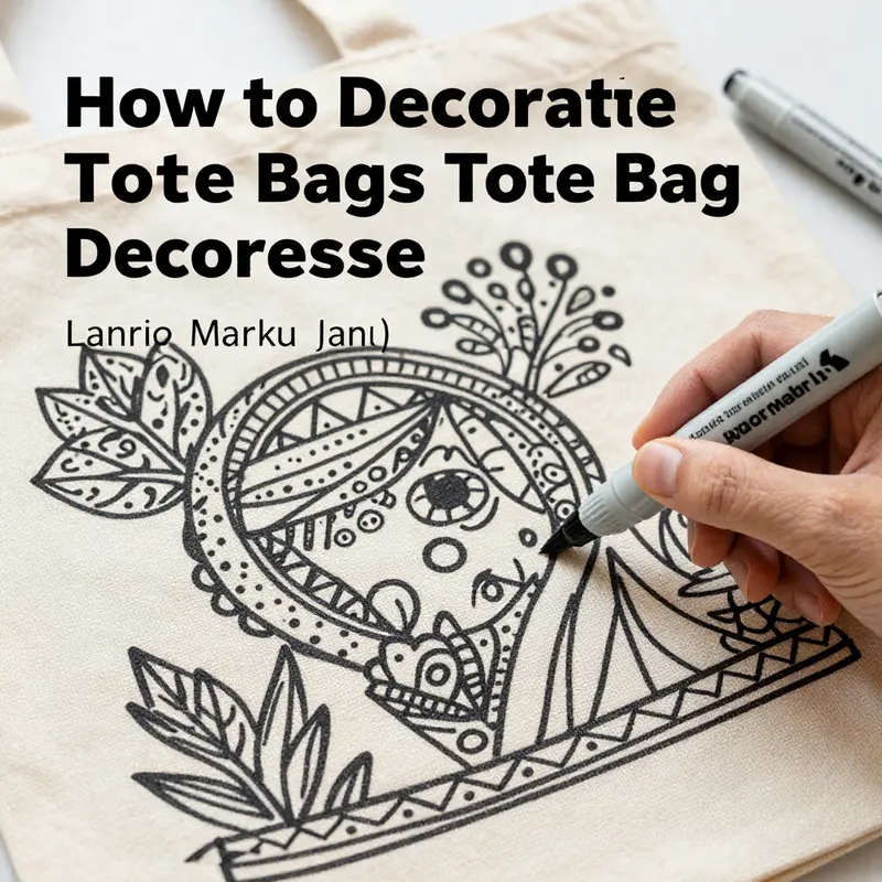
People reach for fabric markers when they want to translate a mood, a memory, or a line of poetry into a surface they carry with them. Decorating canvas tote bags with markers is approachable, forgiving, and surprisingly durable when you respect the fibers and the curing process. It’s a way to curate a personal accessory that aligns with sustainable living—one that says you care about the world you walk through as much as the style you present. This chapter threads practical know-how with a sense of exploration, guiding you to plan a design, execute it with care, and preserve it so your art travels with you for months, even through adventures and everyday errands. The canvas becomes a quiet stage for ink that stays bold, yet flexible enough to survive washings, wrappings, and the inevitable occasional spill of life. And because markers are low-cost and low-barrier, they invite experimentation—the kind of playful, iterative creativity that often yields the most meaningful results. You can start with a simple motif or a crisp typographic line, then let your tote evolve as your ideas do. The aim is steady color, crisp line work, and a design that remains legible even after the bag is crinkled in your hurry to leave the house. The heart of this approach is not perfection but personality, a personality that wears well on fabric and mends easily with a light touch and mindful care.
Choosing the right markers matters, but the core of a lasting design lies in preparation and patience. Textile markers are designed to move with fibers, not just sit on the surface, and the right balance of pigment and binding agent makes a big difference in wash-fastness and color retention. If you’re new to this, start with markers labeled for textiles, and avoid general craft markers that are not made for fabric. The color range can feel vibrant and playful, yet the key is to pick a palette that remains legible under varying light and bag wear. Consider whether your design leans toward bold blocks of color, delicate line art, or a combination of both. A limited, cohesive palette often yields the most sophisticated result, especially when you think about how the colors will play with the bag’s natural tone and any outfit you might pair with it. In this sense, your tote becomes a wearable canvas rather than a one-off experiment. For inspiration on layouts and a sense of how similar totes are used in everyday style, you can explore examples in categories like women’s canvas tote bags. See more here: womens canvas tote bags.
Before you draw, a practical barrier stands between inspiration and a clean final look: bleed-through. To stop ink from seeping from one side of the bag to the other, insert a sturdy piece of cardboard or stiff paper inside the tote. This barrier keeps lines sharp and prevents smudges from migrating. It also helps you gauge how much pressure you’re applying and whether your strokes translate to the back panel as clearly as they do to the front. If the bag is new, a light pre-press with a warm iron can reduce sizing on the surface, which sometimes adds a slight resist to marker ink. If you do pre-wash, skip any fabric softeners that could leave a slick surface that makes ink less obedient to your hand. These small steps are not about rigidity but about giving your design a fair chance to bite into the fibers and stay there through washes and wear. A thoughtful approach to preparation helps you avoid frustration later and keeps the process enjoyable rather than a test of patience.
As you settle on a design, your plan should consider three things: theme, layout, and balance. Themes can be anything from nature motifs to crisp typography, to abstract line art that suggests motion rather than depicting a scene. Layout choices—centered motifs, wraparound patterns, or a bold strip along the bottom edge—alter how the tote reads in motion. Balance means leaving space for negative space so the eye can rest; too many details in a small area can feel crowded, while generous spacing can allow a single word or symbol to breathe and command attention. It can be helpful to sketch ideas on paper first, calculating how much area you’ll allocate to each element and whether you’ll need multiple layers. Layering is a practical concept with markers: you can use fine tips for delicate features and broader tips for filled areas, always letting ink dry between stages to avoid smudging. If you’re uncertain, start with a light pencil guide on the tote itself, then trace over with markers only after you’re satisfied with the shape and spacing. Since markers dry quickly, you can adjust your design on the fly, erasing faint pencil lines with a gentle touch of a clean eraser as long as you’re careful not to smudge the ink.
Drawing with markers is an exercise in control and rhythm. Begin with the outline of each element using a light hand. The first pass should capture the basic forms without pressing hard enough to leave heavy lines that will be hard to soften later. For larger color fields, choose markers with broader nibs and fill in in even, consistent strokes. When you switch to details, a fine-tipped marker becomes essential; it provides the precision needed for fine script, tiny leaves, or minute textures within a petal or feather. You’ll find the most satisfying work happens when you move with a steady pace, pausing to let sections dry to avoid bleeding at the edges. If your design includes lettering, practice the font on paper first. Letter shapes benefit from consistent spacing and a deliberate baseline. A good trick is to draw a light guide line with a pencil, then delete it once the ink has dried. If you make a mistake, water-based markers offer the possibility of a gentle blot with a damp cloth before the ink dries, which can help soften a line or correct a mis-stroke. Alcohol-based markers tend to set more quickly but are harder to correct once dry, so plan carefully before committing to a stroke. Keeping a damp cloth nearby for quick cleanup is a small but powerful practice that saves you from accidental smudges on the bag.
As you build layers, think about how the ink will engage with the fabric’s texture. Canvas has a natural weave, and the ink can settle into the gaps between fibers. This is part of its charm, but it also means your shading and edges may appear slightly feathered if you press too hard on the surface. One technique to achieve dimension without losing legibility is to layer light, translucent tones in areas you want to recede, then reinforce the main shapes with a bolder outline once the layers are dry. You can also create subtle texture by letting a line ride along the weave, then smoothing it with a gentle back-and-forth motion to keep the edge from feeling too stark. The result is an organic look that stays vivid even after a few washes. If your design includes a large color area, work in horizontal or vertical strokes rather than random circles; this keeps the color consistency across the field and reduces the chance of patchy spots. Remember, the marker tips should move smoothly; if the nib starts to catch, stop, reload with fresh ink, and resume to preserve the evenness of your surface fill.
Curing the design is a crucial stage that often receives less attention than drawing. After you finish, give the tote a full drying period—ideally at least 24 hours—so the ink can set and bond with the fibers. Then, to fix the design for laundering, heat-setting is recommended. Place a clean cloth over the decorated area and press with a hot, dry iron, moving steadily to avoid scorching. The exact instructions can vary with marker type, so plan for a cotton setting and a steady, no-steam press. The goal is to activate the binding agents in the ink so they penetrate the fiber surface, locking color in place and improving wash resistance. Once you’ve completed this step, your tote is ready for use and gentle cleaning.
Care after decoration is straightforward but important for longevity. Turn the tote inside out before washing, and use cold water with a mild detergent. Avoid harsh bleaches or aggressive cycles that can wear down the ink’s bond to the fabric. After washing, air drying preserves the texture and keeps the lines crisp; tumble drying on low heat can be acceptable for some marker combinations, but air drying is the gentler, longer-lasting option. If you need to refresh a faded line, retouch once the bag is fully dry, following the same curing steps as before. The goal is to keep the design intact without ever pushing the ink beyond what the fibers can tolerate. These care habits preserve both the garment-like feel of the tote and the expressive quality of your artwork, letting the bag become a dependable companion for years rather than a disposable novelty.
Beyond the technicalities, a marker-decorated tote invites you to consider how your artwork communicates with your wardrobe. A tote can serve as a quiet, reusable ambassador for your personal style. A simple, clean motif might pair with a range of outfits, acting as a subtle signature that travels with you. A bolder, typography-driven design can become a conversation starter at markets, libraries, or daily commutes. In either case, the choice of palette matters more than you might think: a coordinated set of hues that interacts with your typical outfits will feel intentional, whether you’re pairing the tote with neutrals or using it to highlight a bright ensemble. If you’re ever unsure about whether a particular design will read well on a tote, test it on a scrap piece of canvas or a similar fabric swatch first. That quick exercise can save you from committing to a look that feels heavier than intended once it’s on the bag you carry.
As you gain confidence, you’ll find your rhythm and your preferred balance of detail and restraint. The beauty of using markers lies not in complexity alone but in clarity and character—the ability to capture a moment, a motto, or a memory with lines that feel alive on fabric. If you crave more ideas about how to structure motifs and typography on canvas totes, exploring related categories can help you see how others approach the same medium. For example, you can look to resources in the broader tote-bag world and gather ideas about how different textures, fabrics, and bag shapes influence your choices. This cross-pollination keeps your techniques fresh and your tote designs evolving in ways that feel natural and stylish.
In addition to the immediate techniques, consider the broader context of sustainability and personal expression. A decorated tote is more than a fashion accessory; it’s a statement about reusing and repurposing materials with care and intention. When you design with this mindset, your tote becomes more than a container—it becomes a portable canvas that travels with you through the day, reflecting your values and your unique eye. The act of decorating with fabric markers invites you to slow down slightly, to observe how the ink sits on the fibers, how light catches the raised texture, and how small details can transform a plain bag into a personal piece of art. The process is as rewarding as the product: a reminder that creativity can be a daily practice, not a rare event. And because the technique is accessible, it invites friends and family to join in, turning a simple tote into a shared project that expands your creative community while reinforcing sustainable habits.
If you’re looking for further ideas and community inspiration, you can delve into collections and tutorials that align with this approach to decorating tote bags. A well-curated path through related content can offer fresh layouts, new motifs, and practical tips for combining markers with other decoration methods when you’re ready to mix techniques. For deeper context and extended ideas, an external resource with textile art guidance provides a broader view of how artists adapt markers to fabrics and textiles. External resource: https://www.tulipcreative.com/
Stitching Character into Canvas: A Thoughtful Embroidery Journey for Tote Bags
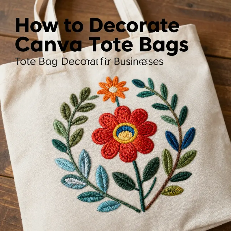
Embroidery on a canvas tote bag feels like a conversation between needle and fabric, a quiet, deliberate act that transforms a simple carryall into a personal piece of wearable art. When you select embroidery as your decorating method, you invite texture, color, and a tactile charm that paints a story with stitches rather than ink. The tote, already a practical companion for daily errands, becomes a canvas for memory and mood, a piece you can carry with you and admire as you move through the day. The core idea is simple: stitch your design in a way that respects the bag’s structure while letting your hand-guided work breathe. This approach balances beginner-friendly steps with room to grow, so you can start small and gradually embrace more complex motifs as your confidence builds. To begin, choose a canvas that will cooperate with your needle and thread. A medium-weight cotton canvas is ideal because it accepts stitches without fighting back, resumes its shape after each pass, and holds details cleanly. If the fabric is too stiff or rough, stitching can feel like wrestling with a stubborn ally; if it is too thin, motifs may sink or distort. The goal is a fabric that stays steady under the hoop and under your fingers, a partner that responds with even tension. Keep in mind that the tote’s everyday use will test your work. The handles experience strain, the front panel endures friction from your side, and the bag frequently folds and unfolds as you move through doors, buses, and classrooms. Embroidery’s magic lies in how your stitches stay put under real-world conditions. That protection begins with preparation, and the steps that follow build on that foundation.
Begin with the design, letting your preferences guide you toward a motif that is both meaningful and practical for a tote. Simple is powerful here. Geometric shapes, floral silhouettes, or a compact monogram can anchor a design without overwhelming the surface. Sketch softly in pencil, or use a light water-soluble marker so your lines vanish with a quick rinse later if you choose. If you crave a crisper transfer, consider a gentle iron-on method or a sheet of transfer paper to keep the lines exact. In any case, verify that your chosen placement is centered and within the usable area of the bag so the motif doesn’t collide with seams, pockets, or edging. The inner peace of embroidery comes from a plan that respects the bag’s geometry while still inviting creative play. It is not a race to fill space; it is a careful dialogue with fabric. When you’re ready to begin stitching, a hoop is your ally. A 5–7 inch embroidery hoop provides the right amount of control without crowding the bag’s surface. Secure the fabric taut, but not stretched so tightly that it strains the fibers. The hoop serves as a guide for even stitches, keeping your lines straight and your curves smooth. If you choose to work directly with no hoop, proceed with a patient, slow rhythm that maintains even tension in both the fabric and your thread. Either way, your goal is a consistent surface that allows your stitches to lie flat and tidy.
Now, pick your embroidery stitches with a practical mindset. Backstitch is a reliable choice for outlines, offering clean lines that won’t leak or blur under stress. Satin stitch is ideal for solid fills, giving you a dense, even plane of color that reads well from a distance. Stem stitch creates graceful, flowing lines for stems, vines, or contours that require a softer hand. Beginners will benefit from starting with these three stitches, practicing their rhythm, and learning how much thread to pull for a smooth, even fill. The key is control: avoid overworking any single area, which can cause puckering or distortion of the canvas. Instead, work in small, deliberate passes, pausing to re-check alignment, tension, and the balance of colors. Color coordination is more art than science. Consider the bag’s base color and any existing accents—handles, pockets, or top stitching—as you select floss shades. A harmonious palette can unify the entire piece, while a single contrasting color can anchor the focal point and draw the eye with a deliberate pop. When you stitch, begin and end threads on the inside of the bag to keep knots tucked away. A few small backstitches at the start and finish anchor the thread securely. If you anticipate dense areas, a stabilizer beneath the canvas can prevent stretching and keep your design from distorting as you work. Tear-away stabilizers are convenient for beginners, while cut-away stabilizers offer sturdier support for intricate patterns. The choice depends on your design’s density and the level of support you want throughout the process. As your stitches accumulate, you’ll notice how texture begins to emerge. Satin stitches catch light differently than backstitches, and the overlap of tiny stitches creates a tactile surface that is both visually inviting and pleasantly resistant to wear. The iterative nature of embroidery rewards patience; each new stitch is a careful addition to the whole, not a rapid fill-in. If you choose to weave in beads or sequins, keep the embellishments in proportion to the design. Small mistakes are often invisible at a distance, but large missteps can derail the overall balance. A well-considered bead placement can accentuate a flower’s center or add a delicate shimmer along a border, provided you anchor each embellishment securely. Be mindful of weight: beads add bulk and strain, so placement should be strategic and limited to areas that will not tug at seams during use. If your heart leans toward texture rather than sparkle, explore the effect of layering stitches to create shading within a single motif. Subtle transitions from light to dark threads can mimic a gradient, giving depth to petals or leaves without introducing bulk. Once the embroidery takes shape, the finishing touches reveal your bag’s personality. You may choose to add a small bead cluster at the intersection of lines, a tiny satin-filled flower, or a simple monogram near the bottom corner to ground the composition. Be mindful of balance; a design that is too busy can overwhelm the tote, while a spare mark can feel underwhelming. The finishing touch is nurturing the fabric’s integrity after the last stitch. If you used a stabilizer, tear away the excess while leaving enough support to protect the design. Trim stray threads and weave in loose ends so they disappear into the weave. Cleaning and care are essential to the longevity of your embroidered tote. When the bag is ready for a wash, opt for cold water and a gentle cycle, and consider placing the bag inside a mesh bag to shield it from friction. Some dyes and markings may bleed or fade; if your marks hadn’t fully dissolved during finishing, a quick rinse can help. Air-dry flat, avoiding direct sunlight that could fade colors over time. The goal is to preserve the embroidery’s crisp lines and vibrant hues while keeping the canvas from stretching or puckering after washing. In the long run, embroidery rewards deliberate practice. Don’t be discouraged by early wobbliness or uneven stitches; even the most accomplished embroiderers begin with modest designs and a patient hand. Don’t let high difficulty discourage you—start simple, build skills gradually. A steady path toward confidence is what transforms a plain bag into a personal gallery for everyday life.
To place your work in a wider context, consider how your embroidered tote can become part of a broader wardrobe narrative. A well-executed motif can echo a favorite outfit or a cherished memory, creating a subtle continuity between your accessories and your clothing. If you want to explore how fabric choices influence the final look beyond embroidery, you can begin with a broader view of fabric-tote-bags-for-women. This internal resource can offer inspiration on how different canvas textures and colorways affect stitch visibility and overall harmony, helping you align your embroidery with the bag’s existing character. For additional technical guidance, you may wish to consult external tutorials that address embroidery in depth. A respected, comprehensive guide to embroidery technique can support both beginners and experienced stitchers as they push into more complex motifs and finishing strategies. External resources open doors to new stitches, patterns, and approaches that can refresh your practice while keeping your tote’s integrity intact. As you advance, you’ll notice the patterns you choose reflect not only skill but also your own evolving taste, turning each tote into a signature piece that travels with you and accumulates stories through its visible stitches.
If you think ahead about how your tote will pair with outfits, you can imagine the bag as a small stage for your embroidery’s color drama. A restrained, monochrome palette can lend a minimalist, timeless air—perfect for workwear or weekend errands—while a bold, saturated palette can act as a focal point in a casually curated look. The tote’s practical silhouette offers ample surface for experimentation without overwhelming your wardrobe. You’ll learn to anticipate the bag’s daily life: a tote should resist fraying at the edges where the handles meet the body, hold up to repeated folding, and carry the weight of groceries or books without deforming your intricate stitches. Through embroidery, you gain a sense of the bag’s personality even before you slip it onto your shoulder. The process teaches patience, spatial awareness, and an appreciation for negative space. The empty areas matter as much as the stitched ones; they allow the eye to rest and the design to breathe. When executed with care, embroidery turns the tote from a functional object into a personal artifact, something that carries your taste and your craft wherever you go, a portable reminder of the time you took to create something meaningful with your hands.
In the end, the embroidery journey on a canvas tote is about balance. It balances practicality and artistry, speed and precision, tradition and experimentation. It rewards a thoughtful approach: a simple motif thoughtfully outlined, a careful choice of stitches that suit the fabric, a controlled use of color that complements the bag’s natural tones, and a finished piece that feels sturdy and alive. The tote remains a tool for daily life, but it becomes an extension of your creative self, an object that travels with you and ages with you in its own unique way. The beauty of this craft is that you can always return to it with fresh eyes. You can start anew on the same bag with a small alteration—perhaps a single new leaf, a different border, or an alternate shade in the same motif—and watch the piece evolve as you gain confidence. Embroidery offers that intimate, incremental path toward mastery, a slow blooming that yields lasting satisfaction as the stitches settle and the colors settle in your memory as well as the fabric. So, pick up your needle, set your design in front of you, and let your hands tell the story your tote has been waiting to wear. The result will be more than decoration; it will be a narrative stitched into fabric, a wearable reminder that a simple canvas can become a canvas of character through the patient craft of embroidery.
External resource: https://www.craftyarncouncil.com/embroidery-tutorial/
Final thoughts
Decorating canvas tote bags presents a multifaceted opportunity for businesses to promote sustainability while expressing their brand identity. Whether through the vibrant techniques of fabric painting and markers, the precision of iron-on transfers, or the timeless appeal of embroidery, each method offers unique avenues to create memorable, functional products that resonate with customers. By using these techniques to customize tote bags, businesses can strengthen their connection to environmentally conscious consumers and create stylish promotional items that align with contemporary values. Unearth the potential of these decoration methods and elevate your brand’s presence in a visually impactful manner.